
Centuries ago, the edges of the pages of a book were sometimes decorated in gold leaf, abstract designs, or even tiny paintings as a display of the wealth and status of the owner. At that time, books were rare and valuable, and great care was taken in all aspects of their production.
Fortunately for us, books are no longer as difficult to obtain or as expensive as they once were. Mass production led to lower prices but also a certain uniformity in book design. Fancy bindings and fore-edge (the edge opposite the spine) painting retreated to the realm of artisans and generally weren’t done by cost-conscious trade publishers.
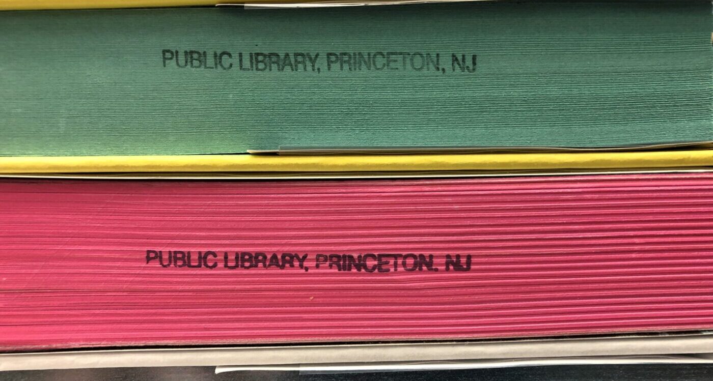
However, I have noticed a recent trend of books showing up with colorful edges or even designs on their text blocks. I don’t know if publishers are doing this to help their books stand out from the crowd or if they want the books to “pop” on BookTok. Whatever their reasons, I admit that this attempt to grab my attention has worked. Below are some of the new and striking additions to the library’s collections.

This terrifying tale of a cursed film has the edges of the text block in red (of course).

This new Norse-inspired fantasy romance series features a gorgeous iridescent cyan text block.

A very hip travel guide to Japan deserves a very hip hot pink text block.

A utopian/dystopian murder mystery set on an idyllic island gets a pretty teal (and maybe ironic?) text block color.

My favorite is this design for the concluding volume of the Afro-futurist fantasy series Legacy of Orïsha. The fore-edge features a different design that is even more intricate.
The next time you are browsing the library be sure to look beyond the covers and check the edges of the book for some colorful surprises.
All photos by the author.