
If you’ve visited the library in the past few months, you will have noticed that we are in the midst of a major renovation, one that completely closed the second floor as it undergoes a “reimagining” to provide a better use of space and resources for the future. But our physical space is not the only one getting a fresher, more modern look. This fall, those of you who have visited our website will have noticed that it too, has undergone a number of changes, with an eye to making the website more accessible, usable, and readable for you, the customer. It has also become more manageable on the backside for the library staff so we are able to make changes and corrections more quickly and easily.
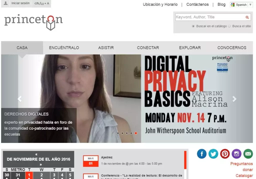
At first glance, if you are using a laptop or desktop, you might not notice some of the changes right away. The main page has a similar look and feel to the previous version but with subtle differences, largely meant to make viewing easier. You’ll notice a bit more white space around the text, an increase in the font size for better readability (great for my aging eyes) and the headers are a different font from the text so that your eye can tell the difference. Most of the text is black with red text now used only to denote a link to another page.
Though our website is in English, you now have the option of choosing another language. If you look in the upper right hand corner, you will see a Select Language box. Google Translate is now built-in with a variety of language options, opening our website to a wider audience.
For those of you who actively use our events calendar, you will notice many changes here. Easily searchable as a chronological list, you can now also opt to search by month (a calendar view), by the week, and by the day. You can see upcoming events and also find out information about an event from the past. You can search by keyword and also by date. Take some time to explore the many programs we have on offer.
For those who delve a little deeper into the website, you will see that the arrangement of the text on many of the pages has been refreshed. See the new look of the Story Time page or the Books & Reading page for adults. Another new item is the Spotlight feature being added to many of the pages such as this one for adults or this one for kids.
Last but not least, those of you who mainly view the website on a mobile device such as a phone or iPad will notice one of the best enhancements of all, that of responsive design. This is a current buzzword in the tech world and is just a fancy way of saying that the website responds to the screen it is being viewed on and rearranges itself accordingly. Since everything is in regular size type, you will no longer have to squint and try to decipher tiny little print, zoom in and out to expand and contract the page, or use your finger to drag the images around on the screen to find the link to where you want to go. You can easily find the search box for the online catalog, view the sliders for upcoming events, search the events calendar, read the blog, and find all the other usual links through the “hamburger” menu in the upper left hand corner (the three white horizontal lines on a red background). Overall, it’s a very nice viewing experience for those of us who live on our phones.
If you have questions or comments about our website, please stop by the Welcome Desk or give us a call at 609-924-9529, ext 1218. You can even chat with us online and we’ll be happy to help.
Blog post by Gayle Stratton.